
Hide a Section on Mobile/Desktop View
Quick Tip: If you don't like how a section looks on a specific viewport (desktop/mobile), you can hide it and use a different section.
You can hide sections based on viewport via CSS.
Every section in Shopify has a setting that contains a Custom CSS field.
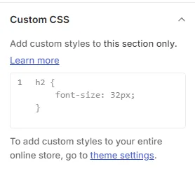
To hide a section on mobile:
@media (max-width: 768px) {
{display:none;}
}
To hide a section on Desktop & Tablet:
@media (min-width: 768px) {
{display:none;}
}
To hide section on Tablet Only:
@media (min-width: 768px) and (max-width: 1024px) {
{display:none;}
}
Add those scripts appropriately and save.
Related articles
Also searched as: 768px, breakpoint, css field, custom css, custom css setting, desktop only, desktop version, different section for mobile, disable on mobile, display none, dont show on mobile, hide a section on phone, hide banner on mobile, hide for phone, hide for tablet, hide image on mobile, hide on desktop, hide on mobile, hide on small screens, hide on tablet, hide section, hide section mobile view, how to hide a section, media query, mobile only, mobile version, remove on mobile, responsive, section visibility, show hide section, show only on desktop, show only on mobile, tablet only, viewport
Did this answer your question?